Alternate Logos
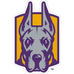
Albany Great Danes
The mascot "Damien" great Dane's head is front-facing in purple, gold, and grey with a gold collar on a gold shield with a white outline.
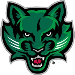
Binghamton Bearcats
Front-facing growling bearcat's head in dark green, green, black, grey, and red.
The shade of grey was changed.
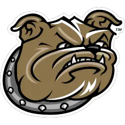
Bryant Bulldogs
A bulldog's head facing to the right and wearing a collar in gold, black, and white.

Maine Black Bears
A front view black bear in black, grey, blue, white and red with mouth wide open.
New Hampshire Wildcats
A right-facing and growling wildcat's head in blue, white, and gray attached to the wordmark wall with the initials "UNH" and wordmark "WILDCATS" in white with grey highlights on a blue with grey outline background.
NJIT Highlanders
A blue sword with initials "NJIT" in red with white trim on a blue background and a wordmark "HIGHLANDERS" in white on a red with blue trim banner.
UMass Lowell River Hawks
A right facing river hawk's head in red, white and blue.
Shades of red and blue changed and shading from the teeth and eyes were eliminated.
UMBC Retrievers
An arched initials "UMBC" in white with gold trim on a black background above the left-facing retriever's head in gold and white with black highlights and a gold outline.
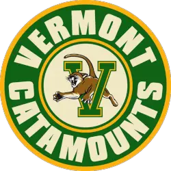
Vermont Catamounts
A catamount in brown, black and white leaping through the letter "V" in green with a gold and green trim in the center of a roundel with a green with gold trim ring and the arched wordmark "VERMONT CATAMOUNTS" in yellow.
College Sports Fan Products


The America East Conference is an exciting part of college athletics for sports fans. The conference has a long and rich history dating back to 1979, when it was founded as the Eastern College Athletic Conference (ECAC) North. The conference has seen many changes in its logo designs and alternate logos over time. In this blog post, we'll look at some exciting logo histories from past to present!
The first America East Conference alternate logo was released in 1995 with an eagle head design featuring two stars above it. This simple yet bold design became iconic for representing the ECAC North's mission of excellence in collegiate athletics across all divisions within New England states like Vermont, Maine, and Massachusetts. The second version came out shortly after with minor adjustments, such as more intricate details on both wings and blue coloring to represent unity amongst member institutions within each divisional boundary line established by NCAA regulations.
From 2005-2010, there were several updated versions which included different variations such as adding text underneath or around the main graphic element or changing up colors slightly; however, none had quite enough impact until 2010 when they unveiled their current official mark depicting a shield shape containing five stars along with “America East” written underneath – this one caught people’s attention! It also symbolizes protection against outside interference while promoting athletic success throughout all nine member schools involved today: University Of Hartford, UMBC, UMass Lowell, Binghamton University, Stony Brook, the University Of New Hampshire, And Vermont.
Last but certainly not least is their new secondary mark introduced just last year - A sleek, modernized version based on the original 1995 eagle head concept but now including four additional elements: lightning bolt (symbolizing power), chevron arrowhead (representing direction/progress), laurel wreath encircling entire image & finally letter “A” standing for America inside center star itself! All together, making up what can only be described in the best way possible – an accurate representation of American East pride!
